<<< Previous Section: Strategy
Your homepage is a summary of what your company offers and a router to more detailed information. It sets the mood for how a potential customer expects their interaction with your company to go.
It will receive more traffic than any other page on your site and it needs to appeal to people in different buying stages, coming in from different traffic sources.
A great homepage stays focused around general positioning, shows brand personality and social proof, and offers clear product info on the 3-5 most important parts of your product.
Common Homepage Components
Homepage Examples
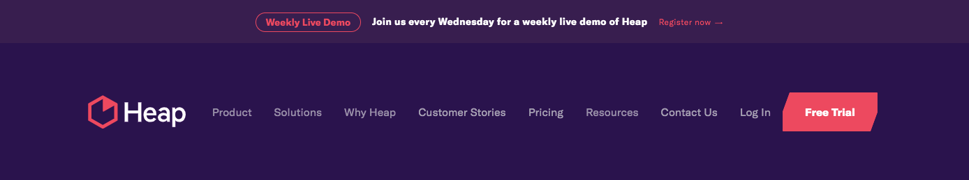
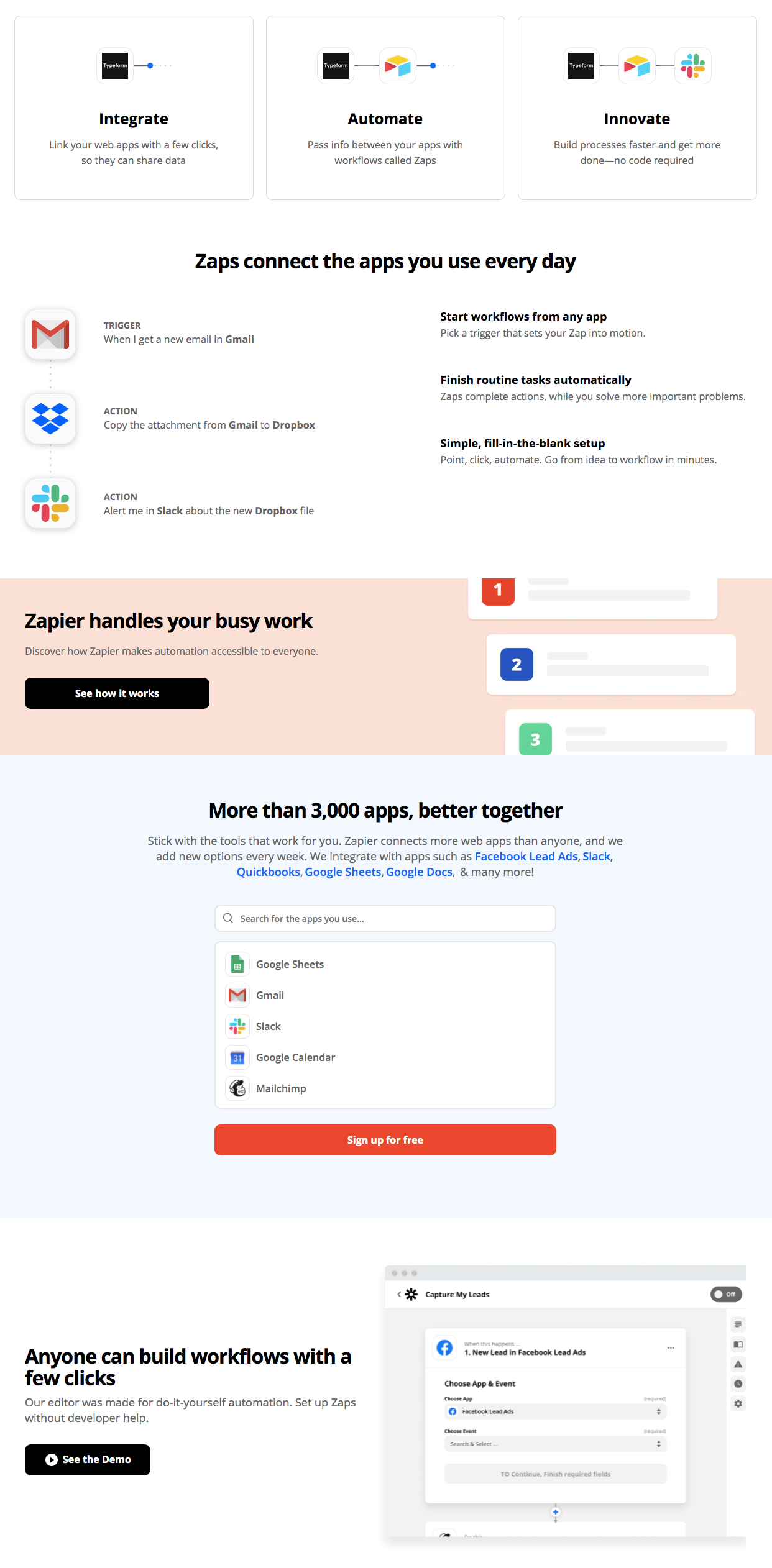
Header
SaaS companies typically keep their headers simple with just a logo, text navigation, and a signup button, though banners have become more common.
Common navigation links:
At the same time, you should have pricing there as “[Insert your company] pricing” is generally far more searched for than any other branded term other than your company name.
What links you include will depend on your unique situation. For example, “Enterprise” makes sense to add for some companies, but not for others.
Header examples


Hero
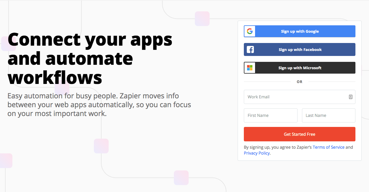
The first section visitors will notice on your homepage is the hero. With your homepage the highest-trafficked page on your site, your homepage hero will be the most viewed section.
SaaS heroes consist of a headline, a subheadline, a call to action (CTA) and an image or graphic to grab a visitor’s attention and draw their eyes to the copy.
Your homepage hero should cover:
Hero: Headline
Hero headlines set the stage for your homepage and communicate the overarching value of working with your product and company.
The hero headline is the first headline your visitor sees. Getting it wrong means the visitor stops reading, so it’s the most important copy you’ll write.
You can think of your homepage headline as “How you help the visitor”.
Typically the homepage headline is a paraphrasing of your USP in 6 to 12 words. Where your homepage headline exists on the scale from benefit-focused to functionality-focused depends on your audience.
For example, business executives typically respond better to more abstract, high-level benefit headlines while individual contributors prefer more concrete, function-based headlines.
Because so many visitors see your homepage hero, the headline is one of the most impactful place to run A/B tests on your site.
Hero: Subheadline
Subheadlines build off your headline, clarifying it, but are more descriptive and longer. They’re also usually more concrete than the headline on "the how" versus "the what", but this depends on your audience and what’s said in the headline.
You’ll want to touch on the major pain points that your product solves and keep it to just two sentences.
Hero: Call to Actions
The hero headline and subheadline are meant to draw the visitor to your CTA. Your CTA should have a high-contrast design that draws a visitor’s eye immediately after the subheadline.
SaaS hero CTAs are typically either a signup button, a demo button, or a combination of a signup button and learn more button. Your CTA button copy should be action oriented and, ideally, specific to your product.
You can use microcopy around the CTA with a high usage number for social proof or the length of your free trial to help further with conversions.
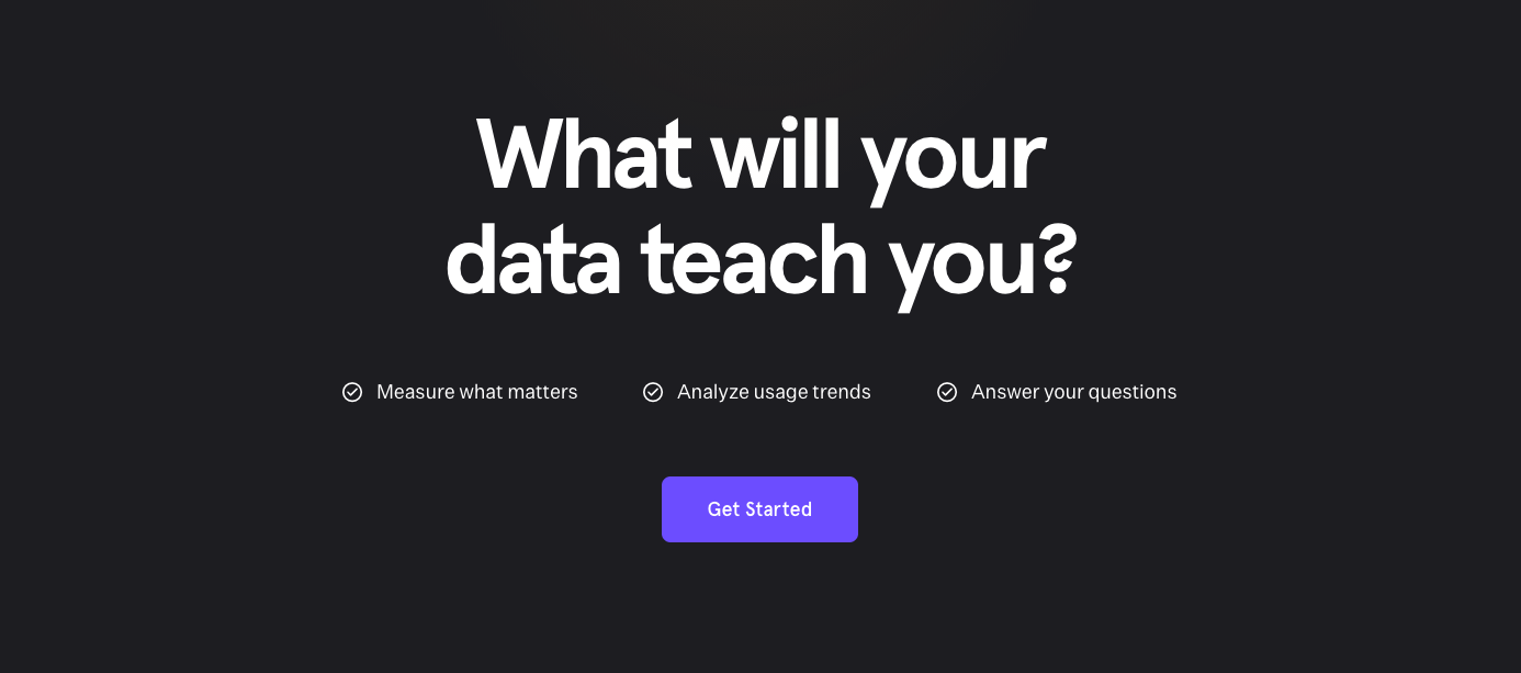
Hero examples

Social proof
The first section of social proof on the homepage is most commonly a group of top customer logos directly below the hero, though sometimes the logos are in the hero itself.
Companies that don’t have enough customers or impressive enough customers to display can use press logos if they have coverage from recognized publications.
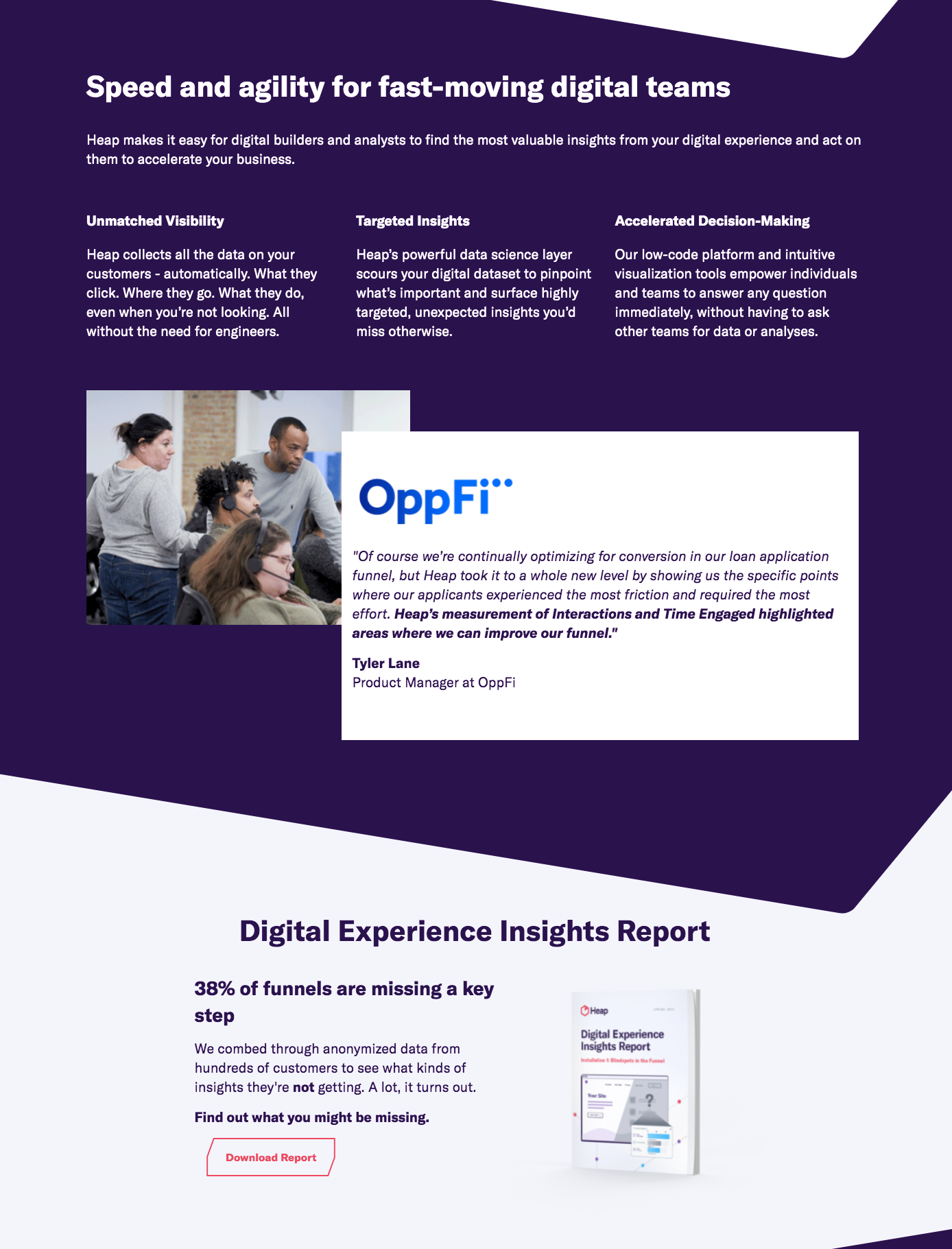
Some take it further and include quotes from people in key positions alongside the logos.
Don’t stop here with social proof. If you have an opportunity to use it some elsewhere in your homepage, go for it. It’s hard to overdo your social proof.
Social Proof Examples
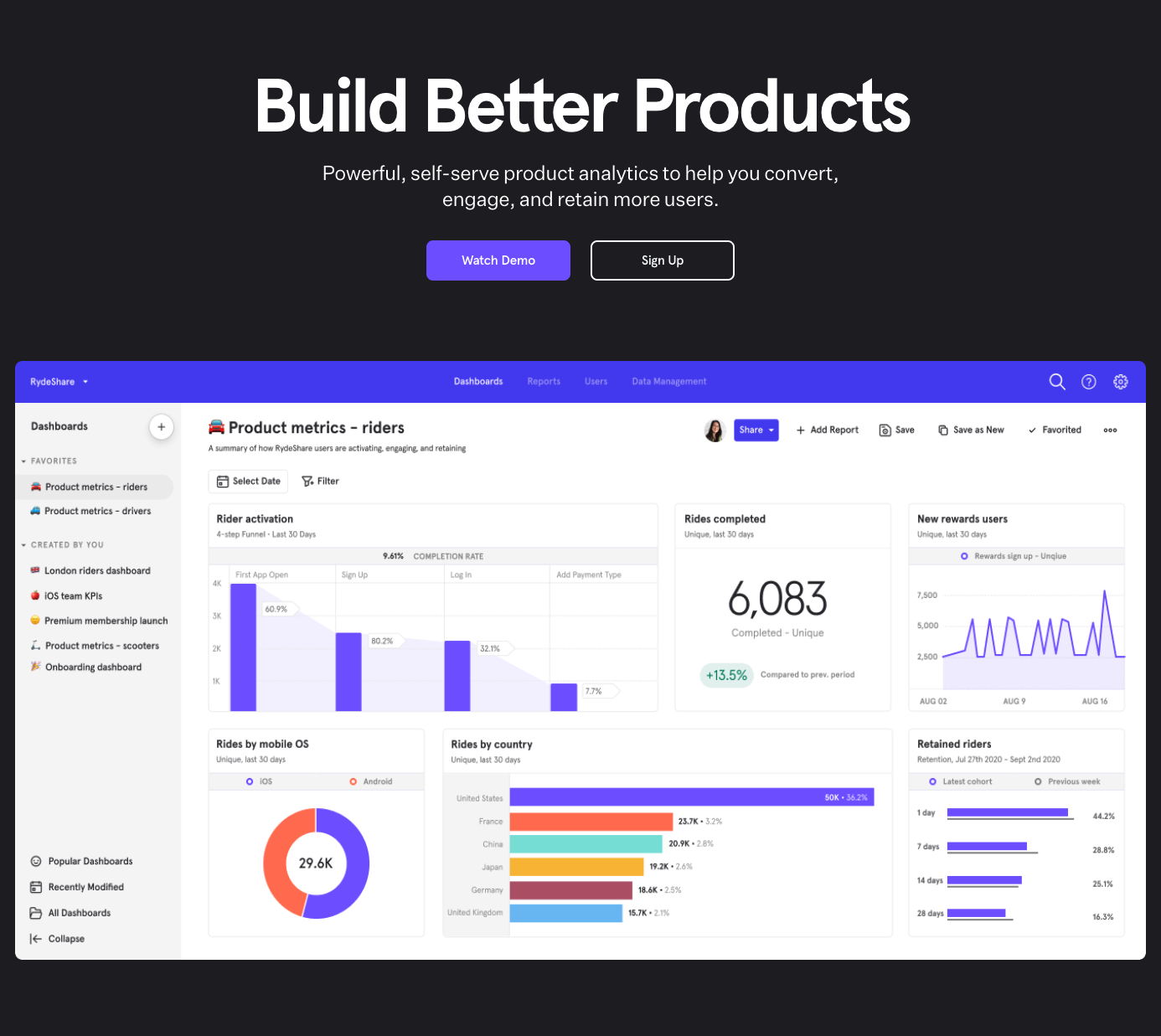
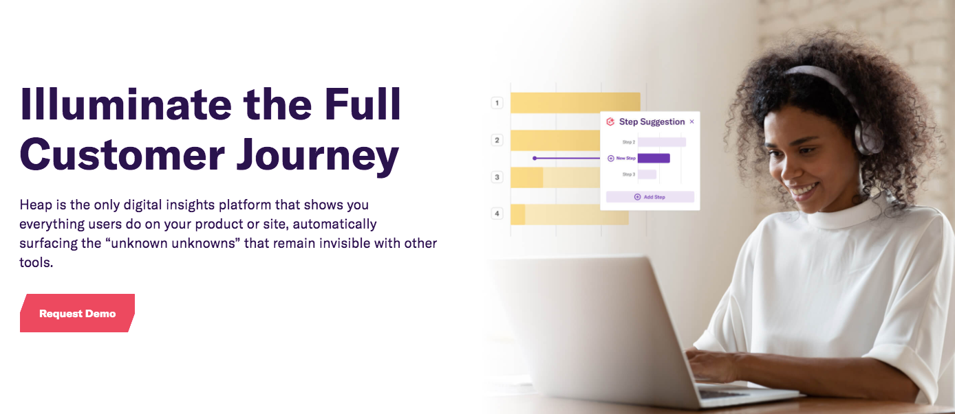
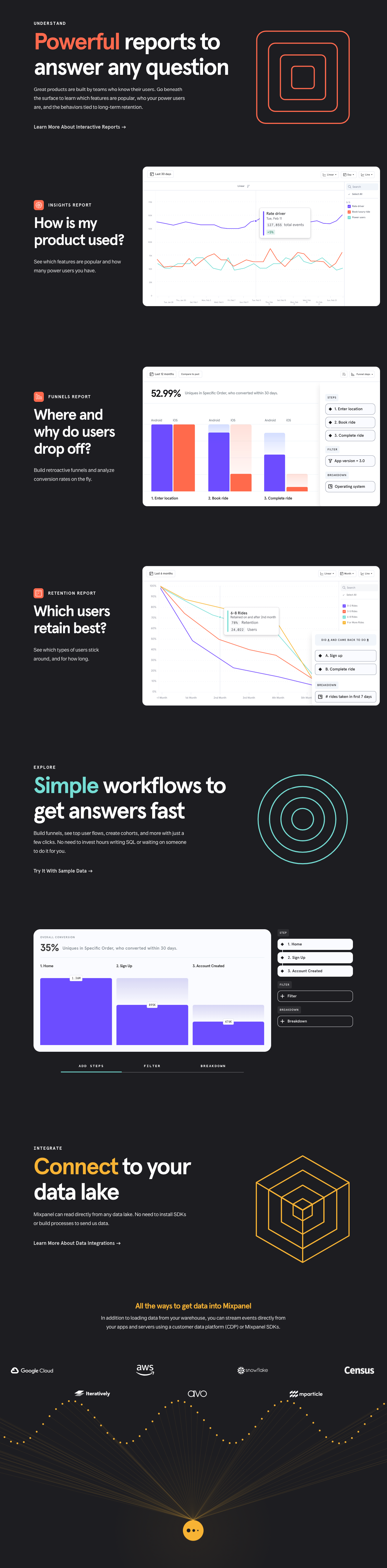
Highlighted Product Features and Benefits
The product features and benefits section is the meat of your product information and the biggest section on your homepage.
This is where you highlight the biggest 3-5 features or abilities of your product that support the UVP you presented in your headline.
In SaaS, these individual feature sections tend to look similar to heroes with a headline, a subheadline, an image (ideally a real UI image) and, in some cases, a CTA leading to more info about that feature.
Each is a summary that’s meant to drive curiosity to learn more and is essentially a mini-sales pitch.
Highlighted Product Features and Benefits Examples
Other sections
SaaS homepages often will feature a content section here, like their blog, their community, or a resources section.
Sometimes case studies will get a dedicated section and be placed to further sell a visitor before the next section, your repeated CTA.
CTA repeated
This is generally a repeat of the hero message, but shorter and with language that considers the visitor has scanned down your homepage and learned about your product by this point.
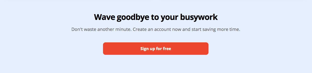
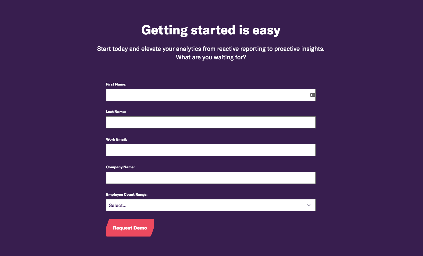
CTA Repeated Examples
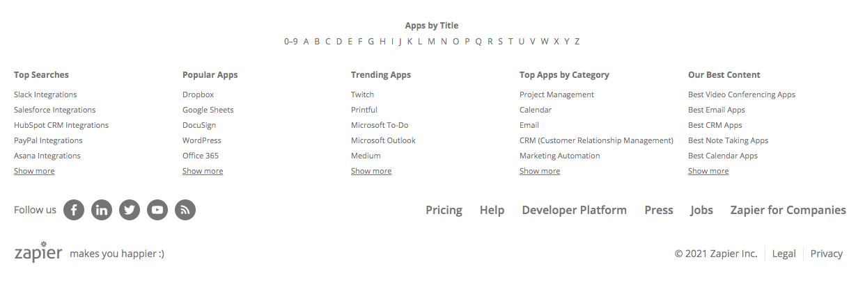
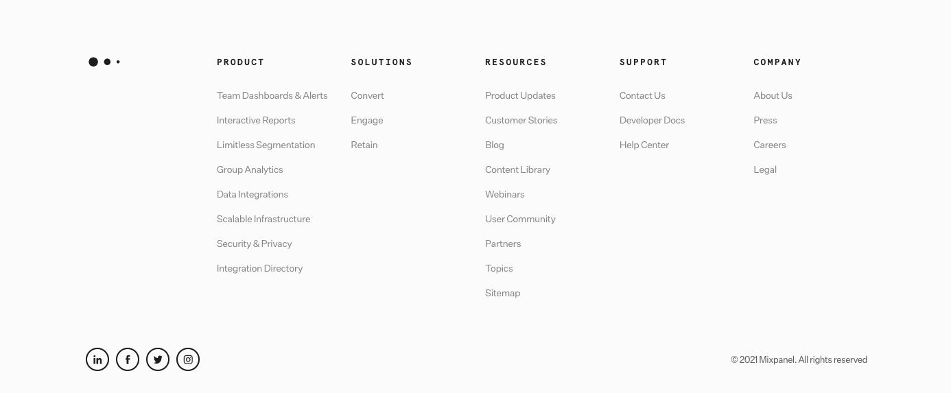
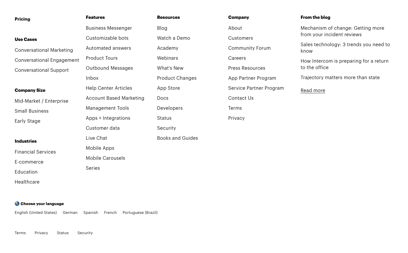
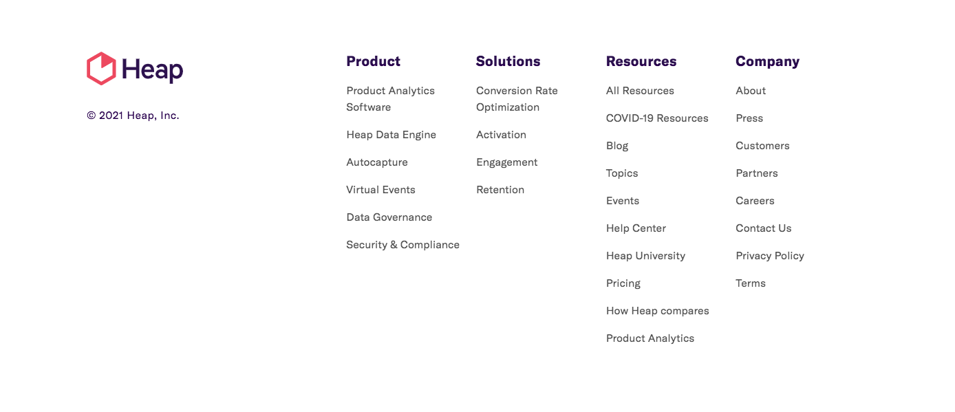
Footer
Where SaaS headers are typically simple and focused, SaaS footers have more variation featuring 2-4x as many links, linked social icons, and, sometimes, a very simple signup form with just an email field and submit button.
The footer is where the “other” audiences such as the press and job seekers are served with your press kit and a jobs link.
Footers also contain the “administrative” links of your website:
Some companies include key contact information in the footer on top of including a dedicated contact page, making it easier to find.
Footer Examples